Solution
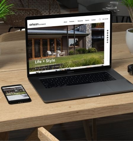
The website solution for the rebranded Artisan Exterior was to create a digital space that highlighted the high quality products that Artisan offered. The rebrand was sophisticated, clean and modern, and the website needed to showcase the products on the same level.
We prioritised the User Experience (UX) by creating a mega-menu that allows search by category (Floor/wall/pool) and the user to either browse each landing page, or delve further into the subcategory of material (porcelain, natural stone etc.).
In the initial meeting, the client identified that not knowing what material they wanted was a user pain point, and they were typically only interested in the style and colour of a tile. However, the mega-menu also caters for users who know which product they’re looking for by navigating straight to the material of each product type.
Each landing page (‘All floor tiles’, for example) offers education and value through a short blurb description of the applicable product.
A further function we proposed was the ‘compare’ feature. This allows the user to add and compare swatches from each product type, side by side. It also allows the user to place floor tile swatches next to wall tile swatches as a visual guide to how they might work together. The user is then able to share their selections with their partner or to a business. This feature is something that not only customers would use, but also the internal sales team, and architects or designers for their clients.
The individual product pages for each colour have a unique URL; from a user’s point of view – where they are focused on the look of the tile – the information for each tile colour was also unique. This is best practice for SEO, and UX. Each product had its own overview copy, key features, tech specs, downloads, install product list and gallery.
