CASE-STUDIES-2023 K-and-C-Harris---Case-Study kcharris-thumbnail
Back To Case Studies

K&C Harris | Website Design & Development

UX / UI DESIGN
CASE-STUDIES-2023 K-and-C-Harris---Case-Study kcharris-thumbnail

The Brief.

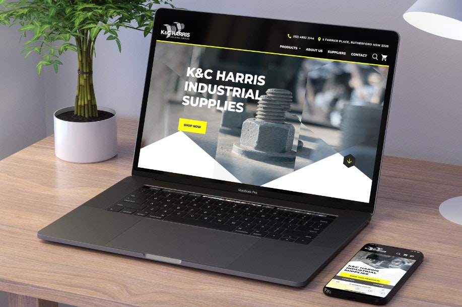
K&C Harris specialise in the manufacturing and distributing of bolts, nuts and fasteners with a traditional shopfront catering for small, medium and large industry as well as consumers. 

What sets K&C Harris apart from competitors is their array of hard-to-get fasteners on the shelf, and being specialists in bolts and fasteners. Furthermore, if they don’t have an item they can get it overnight in most cases, and can even have anything manufactured if the product doesn’t exist.

Their website essentially served as an ‘online business card’ that linked products from their suppliers; working against the image they wanted to create in being industry experts with an extensive range of directly-purchasable products and custom offering. 

Along with rejuvenating their digital presence for this, they also wanted to rework their brand to be more modernised. 

K&C Harris worked with Zimple Digital to create a new website to better reflect their brand and take their successful Rutherford shop front and vast product inventory to the digital marketplace.

Objective(s)

  • Create a new website to better reflect their brand and business in the current digital marketplace; they need the ability to sell their products online.
  • Increase market share due to no current online presence, and the ability to sell products through our website.
  • Increase awareness through better UX website design, SEO and the onset of online sales would be measurable objectives.

Process

The website design process started long before any actual design began. Firstly, we identified K&C Harris’s general visual direction, and new ideas they were happy to explore. With a low existing web presence and the need for an evolution of overall branding, we prepared a few visual examples to the client and gathered feedback. 

This feedback was the starting point for the home page design we presented (in desktop and mobile orientations) to demonstrate the K&C Harris branding rework. This included the fonts, colours and iconography along with other visual elements. 

With the visual direction set, a user experience to support K&C Harris’s goals and a signed-off home page design, the remaining pages of the website were completed.

Solution

The biggest challenge for the new K&C Harris site was the e-commerce aspect. Taking a non e-commerce supported website to one that included this functionality required deep discussions around the best way to set up and categorise products with their large product range and need to satisfy and create interest to the consumer market. 

With that, our design solutions were to:

Take an opportunity to create a compelling homepage banner artwork that would generate excitement to the nuts and bolts product offering. 

Create an experimental, though ultimately effective, background hexagon pattern to set the theme for the primary graphical shape throughout the site. This hexagon shape was inspired by the hex bolt found in the K&C Harris logo.

Have a slider on the home page to create alignment to the industries K&C align with and provide services for.

Include custom-order modules with the floating hardware to bring awareness to the fact that K&C Harris could manufacture anything if it wasn’t available, direct from the online store. This links through to the custom order form found under the tab on the contact page to allow users to upload files and be assisted with requests.

Make the mega menu advance enough to incorporate four levels of categorisation including variants and subtypes of products. This ensures a great UX and allows users to find the exact products they were looking for.

Have two ways to explore the catalogue of products using a “grid” or “listing” view along with quick filters from the left hand navigation. 

The Stats.

100%
Score on customer satisfaction
swipe

Evaluation

The new K&C Harris website meets the client’s needs while also featuring e-commerce functionality to accommodate their online user base. The design enhances the core brand and pushes the visual direction to expand the components that previously existed. We are delighted to deliver a project that creates great user experience and visually interesting design, while meeting the client’s needs and delivering a solution that allows their business to grow.

I'd like to start a project similar to this

Start a project
Start a project
CASE-STUDIES-2023 Zenviron-Case-Study ddwf-3 CASE-STUDIES-2023 Theralux---Case-Study shutterstock-484957858-r CASE-STUDIES-2023 Profilo-Surgical---Case-Study Profilo-listing-new CASE-STUDIES-2023 Cveta---Case-Study Elton1000x1000-2
CASE-STUDIES-2023 Zenviron-Case-Study ddwf-4

Zenviron | Website Design & Development

Read More
CASE-STUDIES-2023 Theralux---Case-Study shutterstock-484957858-r

Theralux | Website Design, Development & SEO

Read More
CASE-STUDIES-2023 Profilo-Surgical---Case-Study 2

Profilo Surgical | Website Design & Development

Read More
CASE-STUDIES-2023 Cveta---Case-Study Elton1000x1000-2

Cveta Property | Website Design and Development

Read More